
Data + Journalism 2nd Edition: Scraping Excerpt
Aug. 4, 2026

Editor’s note: The 2nd edition of “Data + Journalism: A Story-Driven Approach to Data Storytelling”, co-authored by Samantha Sunne and I, is now available from Routledge. This is an excerpt from one of the chapters on how to scrape a dataset from a web page. (Order here).
The Federal Highway Administration posts data about its bridge inspections in US states and territories. The National Bridge Inventory database rates bridges as being in Good, Fair or Poor condition. By sorting and filtering the data in a spreadsheet, you can determine which states have the most bridges and highest percentage of bridges in each category. You also can create a new category -- Fair-Poor -- to group the sub-par bridges together.
Every two years, The Federal Highway Administration does more-detailed studies than the ARTBA research in 2017-2019. The 2023 National Bridge Inventory-Bridge Inspection Safety database ranks bridges in three categories: Good, Fair and Poor condition. With some sorting and filtering in a spreadsheet, you can determine which states have the most bridges and percentage of bridges in each category.
Video: Watch this video to follow along with exercise 1
You also can create a new category: “Fair-Poor condition” to group the sub-par bridges together.
Sponsor

We’re using Google Sheets for this exercise, but if you prefer Excel, you can follow the same steps, though the tools you’ll use are named a little differently. You’ll develop a preference over time.
Download the NBI dataset by scraping it this page below. We covered scraping in Chapter 3: https://www.fhwa.dot.gov/bridge/nbi/no10/condition23.cfm
=IMPORTHTML(”https://www.fhwa.dot.gov/bridge/nbi/no10/condition23.cfm“ ,”table”, 0)
*-If you are having trouble scraping the dataset, just download it or make a copy from here and save into your Google Drive: https://bit.ly/bridgedata2023
Once your sheet is scraped, label it and scroll slowly. See what the columns and rows represent, and make sure there are no empty or garbled cells. Data entry with some government entities can be spotty. If data is missing or garbled, contact the public information officer for that government agency to get the issue cleared up.
Pro tip: To move around quickly on a large dataset, hold down on the CMD (Apple) key and use the directional arrows to move up-down and side-to-side. On a PC, hold down the Control key and use the arrows.
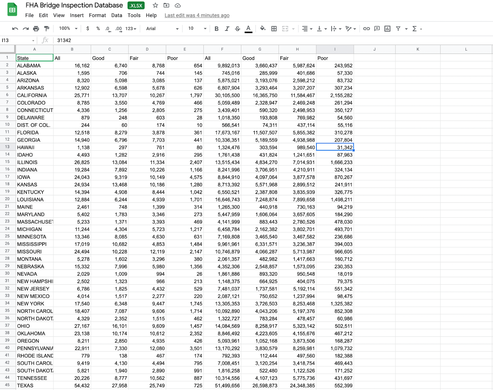
Bridge inspections database in Google Sheets
Develop the habit of always working with a copy of the original data. By clicking this worksheet tab, you can duplicate it. You might do this repeatedly during your analysis, naming each sheet whenever you make a significant change to the data. That way, you will have an audit trail of your work.
The first row of any dataset you work with should be labels of what each column of data represents. It should never start with just the data. In this case, there are two rows of labels: Bridge Counts and Bridge Area (in meters) . For this exercise, we’ll focus on the Bridge Counts. Lock your column headings in place so that as you scroll down, you can always see what each column means. In Google Sheets, you do this by going to View > Freeze > 1 row.
Do a slow scroll through your dataset and make sure the set is complete and there are no empty or garbled cells. Data entry with some government entities can be spotty. Make sure your set passes initial inspection before starting any analysis. If data is missing or garbled, contact the public information officer for that government agency to get the issue cleared up.
For more data journalism tips, tricks and exercises, visit the Data + Journalism blog.
Sponsor: visualping

Please welcome our new sponsor, visualping. This is a tool I’ve been using for a long time, and its AI features added in the past few years have taken it to the next level.
Video
This training video will take you through the basics of using Google’s NotebookLM:
Sponsor: Nota

Be sure to check out the incredible production tools suite with our longtime sponsor at HeyNota.com
More Tools and Research
Chartle
Generates charts from plain English descriptions. Type something like “US newsroom employment over the last 20 years” and it finds the data, picks the right chart type, and renders it in seconds. It can also recreate charts from screenshots, which is useful for pulling editable visuals out of PDFs and reportsSimplifying AI Newsletter
Master AI daily without the overwhelm. Join 20,000-plus professionals getting practical tutorials, trending news, and tools that actually matter.Powering the News
Free resources for “worker-friendly” newsrooms from the Reynolds Journalism Institute. It includes quizzes, guidebooks and templates. It also features a newsroom database, which is based on the first national survey of non-traditional, worker-friendly media.Actually Relevant News
A news curation platform that crawls more than 80 sources across five languages daily, using LLM analysis to evaluate each article’s relevance to humanity on transparent criteria. It publishes only the most relevant stories across four issue areas (Human Development, Planet and Climate, Existential Threats, Science/Technology), with every story showing a full relevance analysis. Free to use with no ads, no tracking, and no paywall — plus a free public API, RSS feeds, weekly newsletter and a positivity slider that lets readers filter by emotional tone.How 9 Facial Recognition Services Handle Images, Disclose Ownership, and More
Textbooks
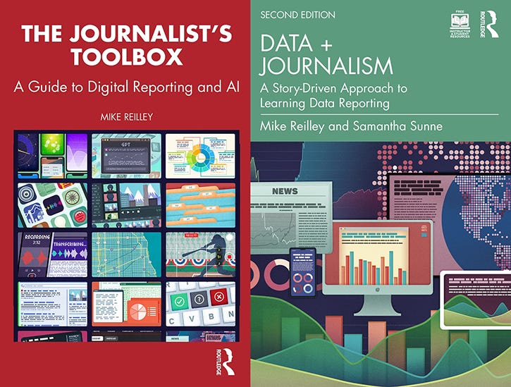
Data + Journalism, 2nd Edition
Samantha Sunne and I co-authored the 2nd Edition of the textbook, “Data + Journalism: A Story-Driven Approach to Learning Data Reporting” that is available from Routledge and other booksellers. It’s an introductory- to intermediate-level guide to learning data storytelling from A to Z. The second edition features new tools, datasets, exercises and AI tools.
The Journalist’s Toolbox
My book, “The Journalist’s Toolbox A Guide to Digital Reporting and AI” was published by Routledge in 2023 and focuses on concepts and tools still used today. You can order it here.

In Quotes …
“AI is a tool. The choice about how it gets deployed is ours.” —Oren Etzioni, AI researcher
Follow me @itsmikereilley | @journtoolbox | Subscribe on YouTube | Subscribe to this newsletter