
Building Graphics With Gemini Canvas
Feb. 17, 2026

A Google Gemini Pro account gives journalists options to create charts and infographics with text prompts and a dataset. For me, it’s worth the $20 a month because of the quality of multimedia you can produce with it.
Just log-in to Gemini.google.com, upload and data (it handles PDFs and spreadsheets) and type your prompt. Select the “Canvas” option from the Tools pulldown menu and hit the paper airplane icon on the lower right corner. Once Canvas creates your content, click on Create > Infographic. Gemini converts your complex data into a visualization.
Sponsor

News Media Help Desk is a hub for local media news organizations to get digital help.
We’ll help you with free resources like case studies, how-to guides and our Scorecard database of tools. For more help, send us a note and we’ll answer your question or refer you to our fractional services partner who can match you with a vetted expert.
Visit the Help Desk at newsmediahelpdesk.org
You can use follow-up prompts to adjust fonts, colors, chart types, etc. I tested this with some Chicago homicide data – asking only for visualizations, and it gave me four graphics: bar chart, line chart, highlight grid of key data and a list of takeaways.
It writes accurate headlines with everything spelled correctly. It even made accurate calculations showing the highest and lowest years for homicides, and an accurate average.
You can request static or interactive charts, and it provides a toggle so you can see the code that built the chart.
Here’s a static chart of a dashboard I created off a spreadsheet of Chicago homicides data using Gemini Canvas:
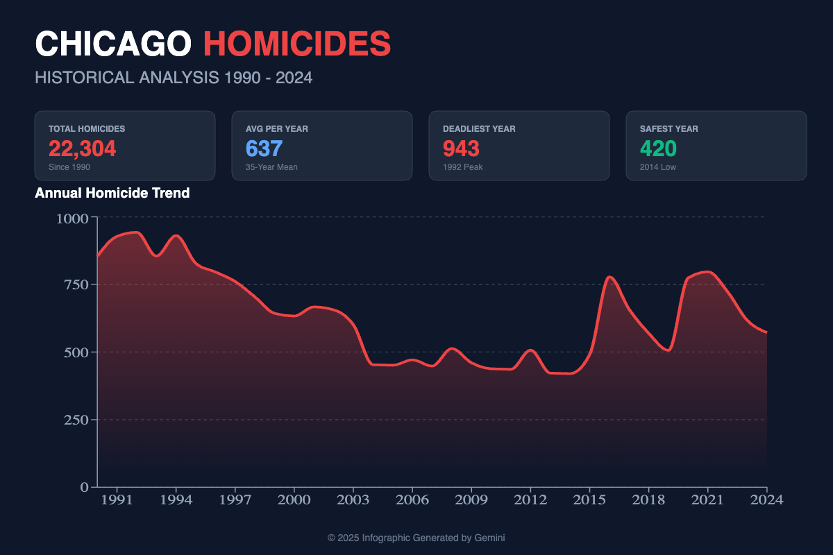
But be careful. A word of caution about using AI tools for charts: Proofread and spot-check everything. Make sure the data on the spreadsheet or other document matches the chart. Check for scale, misspellings and other typos or errors. Fact-check everything.
Also look at color and clarity. In the example above, I didn’t like that Gemini chose red, the color of blood, for the homicide chart headline and line chart. A follow-up prompt can easily change the color to blue or something else. Or you can tell it to exclude red in the initial prompt.
If you want to create this chart yourself, download this dataset and play the video below.
Find more tools for creating interactive charts and infographics on The Journalist’s Toolbox.
Video
This video will walk you through the steps for making the Chicago homicides chart with Google Gemini Canvas as well as NotebookLM.
Sponsor

Be sure to check out the incredible production tools suite with our new sponsor at HeyNota.com
More Tools and Research
Answer This
Create academic workflows and diagrams for books, presentations, presentation boards, etc.Meta SAM Audio
AI audio editor dropped in late 2025 lets you drop out background noise to hear a person speaking, among many other features. Free download to your desktop.Tow Center for Digital Journalism News Publisher-AI Company Tracker
Monitor the evolving relationship between news publishers and AI companies. It catalogs lawsuits, licensing deals, etc. on publicly available information, giving a clearer picture of how this landscape is taking shape. You can export data from the site.MangaTranslators
AI manga image translator that automatically detects and translates text from manga, manhwa, and comics. Upload images, choose a target language, and get translated images while keeping the original layout. Supports more than 50 languages.NotebookLM Assistant
A Gemini tool built by Jeremy Caplan of CUNY and the Wonder Tools newsletter. Get a personalized plan to use Google’s free NotebookLM tool. We’ll generate the prompts, queries, and structure you need to get started. These quick suggestions are just starting points for you to edit and improve.Notebook LM Kickstarter in Claude
Tool from CUNY’S Jeremy Caplan to help write better prompts for Notebook LM results.Prompt Genie
Enhances ChatGPT prompts for better-aligned results
Textbooks
The Journalist’s Toolbox
My new book, “The Journalist’s Toolbox A Guide to Digital Reporting and AI” was published by Routledge in December. You can order it here,
Data + Journalism
Samantha Sunne and I co-authored a textbook, “Data + Journalism” that’s available now on Routledge. (Order here). It’s an introductory- to intermediate-level guide to learning data storytelling from A to Z.
Want More Training?
Contact Mike Reilley at mikereilley1 (at) gmail (dot) com to schedule an AI tools training for your staff.
Also consider a paid subscription to this newsletter or donate to Buy Me a Beer so I can build more training videos.


Become a sponsor: Would you like to sponsor future Journalist’s Toolbox™ newsletters? Our rates are reasonable and our sponsors get results. Contact me at mikereilley1 [at] gmail [dot] com

In Quotes …
“We are living through an information armageddon. Without facts you can’t have truth, and without truth you can’t have trust.” — Maria Ressa, a journalist and professor of professional practice at Columbia University and 2021 Nobel Peace Prize Laureate.
Follow me @itsmikereilley | @journtoolbox | Subscribe on YouTube | Subscribe to this newsletter
Copyright and Trademark 2026 | Mike Reilley